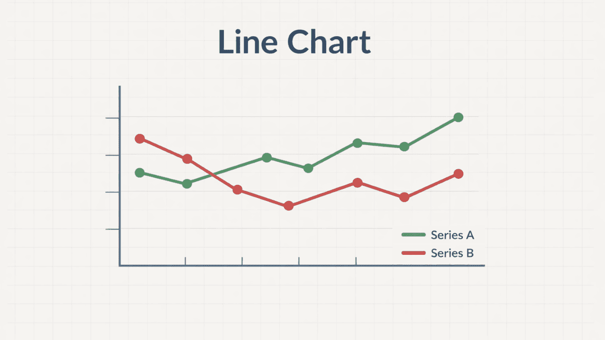
A line chart is a type of data visualization that shows information as a series of data points connected by straight lines. It is commonly used to display trends and changes over time, making it one of the most widely used charts in data analysis.
At its core, a line chart helps you see how values move in relation to one another. The horizontal axis typically represents time or categories, while the vertical axis shows the measured values. This simple structure makes it easy to interpret patterns, whether you are tracking sales, temperature, or website traffic.
Why Line Charts Matter
Understanding why a line chart is important helps you use it more effectively. It is not just a basic chart—it is a powerful storytelling tool for data.
Line charts are valuable because they highlight trends clearly. They allow you to quickly identify increases, decreases, and fluctuations without needing to scan raw numbers. This makes them especially useful for decision-making, forecasting, and presentations.
They also reduce complexity. Large datasets can feel overwhelming, but a well-designed line chart transforms numbers into a visual narrative that anyone can understand.
Key Components of a Line Chart
Before creating or interpreting a line chart, it helps to understand its main parts. Each component plays a role in making the chart clear and meaningful.
X-Axis (Horizontal Axis)
The x-axis usually represents time intervals or categories. It provides the sequence in which data points are plotted.
This axis is essential for understanding progression. For example, it could show days, months, or years in a timeline.
Y-Axis (Vertical Axis)
The y-axis represents the values being measured. These could be numbers such as revenue, temperature, or user counts.
It gives context to the data points. Without it, you would not know the scale or significance of the changes.
Data Points and Lines
Data points are individual values plotted on the chart. These points are connected by lines to show continuity.
The connecting line is what makes the trend visible. It helps viewers see how one point relates to the next.
Labels and Legends
Labels explain what each axis represents, while legends identify different lines when multiple datasets are shown.
Clear labeling ensures the chart is easy to understand. Without it, even accurate data can become confusing.
Types of Line Charts
Different variations of a line chart are used depending on the data and purpose. Choosing the right type improves clarity and impact.
Simple Line Chart
A simple line chart displays one dataset. It is ideal for showing a single trend over time.
This type is commonly used for straightforward analysis, such as tracking monthly expenses or daily temperatures.
Multiple Line Chart
A multiple-line chart compares two or more datasets on the same axes. Each dataset is represented by a different line.
It is useful for comparisons. For example, you can compare sales across different regions or performance across multiple products.
Stacked Line Chart
A stacked line chart shows cumulative data, where each line builds on the previous one.
This format helps visualize how individual components contribute to a total. It is often used in financial or resource allocation analysis.
When to Use a Line Chart
Knowing when to use a line chart ensures your data is presented effectively. It works best in specific situations.
A line chart is ideal when you want to show trends over time. It clearly illustrates how values change, making it perfect for time-series data.
It is also useful for comparing multiple datasets that follow the same timeline. This allows viewers to see relationships and differences at a glance.
However, it may not be suitable for showing exact values or comparing unrelated categories. In such cases, other chart types like bar charts might be more appropriate.
Advantages of Using a Line Chart
A line chart offers several benefits that make it a preferred choice in many fields.
- Clarity: It presents trends in a simple, easy-to-read format.
- Efficiency: It quickly communicates patterns without requiring detailed analysis.
- Comparability: It allows multiple datasets to be compared on the same chart.
These advantages make it widely used in business, science, education, and technology.
Limitations of Line Charts
Despite their usefulness, line charts have some limitations. Being aware of these helps avoid misinterpretation.
They can become cluttered if too many lines are included. This makes it difficult to distinguish between datasets.
They also assume continuity between data points. If the data does not naturally follow a continuous pattern, the chart may give a misleading impression.
Finally, they are not ideal for showing discrete or unrelated categories. In such cases, other visualization methods work better.
How to Create an Effective Line Chart
Creating a strong line chart involves more than plotting points. It requires thoughtful design and clear communication.
Start by organizing your data properly. Ensure that the x-axis follows a logical order, especially when dealing with time-based data.
Choose appropriate scales. The y-axis should reflect the data accurately without exaggerating or minimizing trends.
Keep the design simple. Avoid unnecessary colors, gridlines, or decorations that distract from the main message.
Label everything clearly. Titles, axis labels, and legends should provide enough context for anyone to understand the chart without additional explanation.
Best Practices for Line Chart Design
Following best practices ensures your line chart is both professional and easy to interpret.
Keep It Simple
A clean design improves readability. Too many elements can overwhelm the viewer.
Focus on the essential data. Remove anything that does not add value.
Use Consistent Scales
Consistency in scaling prevents distortion. Sudden changes in scale can mislead the audience.
Always choose a scale that reflects the data truthfully.
Highlight Key Insights
Important points should stand out. You can use markers or annotations to draw attention.
This helps guide the viewer to the most relevant information.
Choose Colors Wisely
Colors should differentiate lines without causing confusion. Use contrasting but harmonious shades.
Avoid using too many colors, as it can make the chart harder to read.
Examples of Line Charts
Line charts are used across many industries because they effectively communicate trends.
In business, they track sales performance over time. This helps companies understand growth patterns and seasonal changes.
In healthcare, they monitor patient data such as heart rate or recovery progress. This allows professionals to make informed decisions.
In technology, they analyze website traffic and user engagement. This helps identify trends and optimize performance.
Common Mistakes to Avoid
Even a simple line chart can be misleading if not designed properly. Avoiding common mistakes improves accuracy and clarity.
One common issue is overcrowding the chart with too many lines. This reduces readability and confuses the audience.
Another mistake is using inconsistent time intervals. This can distort the perception of trends.
Lack of labeling is also a frequent problem. Without clear labels, the chart loses its meaning and usefulness.
Conclusion
A line chart is one of the most effective tools for visualizing trends and changes over time. Its simplicity makes it accessible, while its flexibility allows it to be used across many fields.
By understanding its components, uses, and best practices, you can create clear and meaningful visualizations. When used correctly, a line chart turns raw data into insights that are easy to understand and act upon.
Trade on the Go. Anywhere, Anytime
If you’re ready to apply what you’ve learned, consider trading with a globally recognized forex and CFD broker like XM .
The platform offers competitive spreads, fast execution, and access to advanced trading tools, including real-time charts and flexible account types, making it suitable for both beginners and experienced traders. Open a trading account for free and start trading today and join millions of traders and investors on the global forex market.
Trading involves risk. Ensure you understand how the markets work before investing.